水平居中
垂直居中
水平垂直居中
两列布局
三列布局
等分布局
_Sticky Footer布局
全屏布局
水平居中
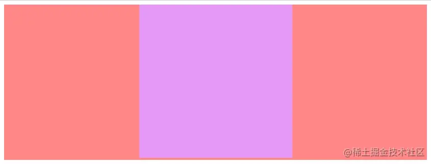
// COMMON CODE<div class="parent"><div class="child"></div></div>.parent { background: #ff8787; }.child { height: 300px; width: 300px; background: #e599f7; }
@see https://juejin.cn/post/7028962991345254407#heading-0
1.使用text-align属性
若元素为行内块级元素,也就是display: inline-block的元素,可以通过为其父元素设置text-align: center实现水平居中。.parent {/* 对于子级为 display: inline-block; 可以通过 text-align: center; 实现水平居中 */text-align: center;// clear-inline-block-gap// @see https://www.cnblogs.com/Ry-yuan/p/6848197.htmlfont-size: 0}.child {display: inline-block;}
2.定宽块级元素水平居中(方法一)
对于定宽的的块级元素实现水平居中,最简单的一种方式就是margin: 0 auto;但是值得注意的是一定需要设置宽度。.child {/* 对于定宽的子元素,直接 margin:0 auto; 即可实现水平居中 */margin: 0 auto;}
3.定宽块级元素水平居中(方法二)
对于开启定位的元素,可以通过left属性 和margin实现。.child {/* 开启定位 */position: relative;left: 50%;/* margin-left 为 负的宽度的一半 */margin-left: -150px;}
4.定宽块级元素水平居中(方法三)
当元素开启决定定位或者固定定位时,left属性和right属性一起设置就会拉伸元素的宽度,再配合width属性与margin属性就可以实现水平居中。.parent {position: relative;height: 300px;}.child {/* 开启定位 父相子绝 */position: absolute;/* 水平拉满屏幕 */left: 0;right: 0;/* 拉满屏幕之后设置宽度,最后通过 margin 实现水平居中 */margin: auto;}
5.定宽块级元素水平居中(方法四)
当元素开启决定定位或者固定定位时,left属性和transform属性即可实现水平居中。.parent {position: relative;}.child {/* 开启定位 */position: absolute;/* 该方法类似于 left 于 -margin 的用法,但是该方法不需要手动计算宽度。 */left: 50%;transform: translateX(-50%);}
6.Flex方案
通过Flex可以有很多方式实现这个居中布局的效果。.parent {height: 300px;/* 开启 Flex 布局 */display: flex;/* 通过 justify-content 属性实现居中 */justify-content: center;}.child {/* 或者 子元素 margin: auto*/margin: auto;}
7.Grid方案
通过Grid实现居中布局比通过Flex实现的方式更多一些。.parent {/* 开启 Grid 布局 */display: grid;/* 方法一 */justify-items: center;/* 方法二 */justify-content: center;}.child {/* 方法三 子元素 margin: auto*/margin: auto;}